
Fig. 8
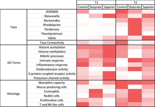
The heatmap brings together the main observations of each analysis and compare them per diet and timepoint. The more representative genera are illustrated with the average relative abundance per timepoint and diet. The taxa connectivity contained the amount of pairs of taxa that correlate to each other in a significant fashion ( |