IMAGE

Fig. 8

ID
ZDB-IMAGE-230306-18
Source
Figures for López Nadal et al., 2023
Image
Figure Caption

Fig. 8

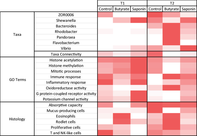
The heatmap brings together the main observations of each analysis and compare them per diet and timepoint. The more representative genera are illustrated with the average relative abundance per timepoint and diet. The taxa connectivity contained the amount of pairs of taxa that correlate to each other in a significant fashion ( p ≤ 0.05). The GO terms contain the transcripts per million (tpm) of all genes expressed in the dataset that collapsed under that GO term. All histological parameters are normalized and scaled (from 0 to 1). Each individual feature within the heatmap is normalized and colored from red (more present) to white (absent)

Acknowledgments
This image is the copyrighted work of the attributed author or publisher, and ZFIN has permission only to display this image to its users. Additional permissions should be obtained from the applicable author or publisher of the image. Full text @ Anim Microbiome