- Title
-
Protein profiling of zebrafish embryos unmasks regulatory layers during early embryogenesis
- Authors
- da Silva Pescador, G., Baia Amaral, D., Varberg, J.M., Zhang, Y., Hao, Y., Florens, L., Bazzini, A.A.
- Source
- Full text @ Cell Rep.
|
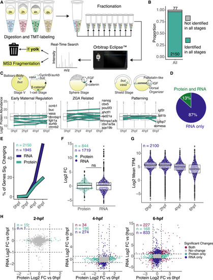
Quantitative proteomic profiles during zebrafish maternal-to-zygotic transition (A) Diagram of mass spectrometry experiment design and analysis. Proteins were extracted and labeled with tandem mass tag (TMT) from four replicates for each time point, fractionated in 9 fractions, and run in an Orbitrap Eclipse instrument. Yolk proteins were added to a contaminants list to be ignored by the instrument during data acquisition. (B) Bar plot represents the proportion of proteins identified in all time points. Proteins that were not quantified in at least 2 replicates or were without Ensembl gene IDs were excluded from further analysis (see Figure S1D). (C) Protein expression plots from previously published early developmental genes in zebrafish. Boxplots represent the log2 of mean protein abundance between the four replicates per time point. Teal lines represent individual gene protein expression over the time course. Cartoons are based on previous publications for localization and temporal expression. (D) Pie chart represents the percentage (%) of identified proteins in relation to all expressing mRNAs in the four time points analyzed. (E) Line graph represents the percentage (%) of significant genes changing at the mRNA (dark blue) and protein (teal line) levels per time point. Significant changes represent fold change (FC) > 2 and adjusted p < 0.05, and n is the number of genes for each type of data, where mRNAs (dark blue) were only accounted for if they were also identified as proteins in our dataset, while only proteins identified in all stages were used. (F) Boxplot comparing the log2FC of significant changing genes for protein (teal) and mRNA (dark blue) at 6 h post-fertilization. Significant changes were considered as FC > 2 and adjusted p < 0.05, and n is the number of significant genes for each type of data. There is no statistical significance between protein and mRNA log2FCs (p = 0.15, Wilcoxon rank-sum test). (G) Boxplot represents the mRNA expression-wide distribution of identified proteins over all time points. n is the number of transcripts expressed as mRNA and identified as proteins. (H) Scatterplot between log2FC in RNA and log2FC in protein levels at each time point compared to 0 hpf. Colored dots represent significant changing genes (log2 FC > |1| and adjusted p < 0.05), and n is the number of genes in each group. |
|
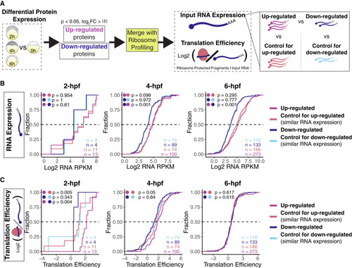
Increase in protein abundance can be explained by translation and higher mRNA expression (A) Diagram for translation efficiency analysis. Proteins were separated as up- or down-regulated, and then the translation efficiency for those encoding mRNA was calculated and compared to groups of genes with similar mRNA expression but unchanged protein levels at each time point. (B and C) Cumulative plots from 2, 4, and 6 h post-fertilization comparing mRNA expression in RPKMs (B) and translation efficiency (C). Colored dots represent statistical tests between groups, and n is the number of genes in each group. When mRNA expression between up- and down-regulated proteins was not statistically different (p > 0.05, Wilcoxon rank-sum test), these groups were compared directly, but when their mRNA expression was different (p < 0.05, Wilcoxon rank-sum test), the groups were compared to their selected controls based on similar mRNA levels. |
|
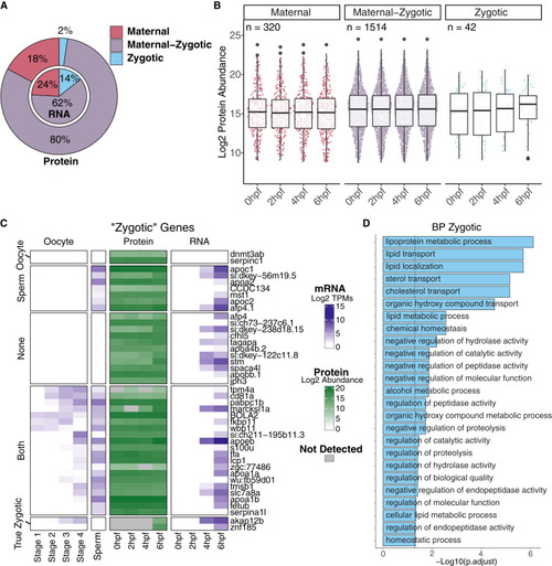
Identified pure zygotic genes at the RNA level are highly deposited as proteins prior to zygotic genome activation (A) Nested pie charts representing the percentage (%) of mRNAs (internal pie chart) or proteins (external pie chart) classified in the three classes: maternal (red), maternal-zygotic (purple), and zygotic (light blue). (B) Boxplot represents log2 mean protein abundance for each class of genes at each time point (see Figure S4B for reference of expected mRNA dynamics of the same genes), and n is the total number of proteins in each classification. (C) Heatmap showing the mRNA levels of zygotic genes in oocyte and sperm (first five columns), as well as protein (green squares) and mRNA levels (blue squares and last four columns) at 0, 2, 4, and 6 h post-fertilization. Data points represent the log2 mean TPMs (for mRNA, dark blue) and log2 mean protein abundance (dark green) for each stage or time point. Gray squares denote proteins that were not identified at those time points. Labels on the left denote possible origins of deposited zygotic protein, with “ oocytes” being only expressed in oocyte RNA sequencing, “sperm” only expressed in sperm RNA sequencing, “both” being expressed in either oocyte or sperm RNA sequencing, “true zygotic” being proteins that follow expected zygotic patterns of expression, and “none” being genes that were not found in either oocyte or sperm RNA sequencing. (D) Bar plot from Gene Ontology (GO) term (biological process [BP]) enrichment analysis for zygotic genes. Categories were considered significant when adjusted p < 0.05 (Fisher’s exact test). |
|
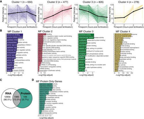
Clustering protein profiles captures protein dynamics throughout the maternal-to-zygotic transition (A) Line plots represent relative protein intensity dynamics over all time points for each cluster. Colors represent different clusters, thick line denotes the median of all lines for each cluster, and n is the number of proteins in each cluster. Relative intensity values span between 0 and 100. (B) Bar plots from GO term (molecular function [MF]) enrichment analysis for each cluster. Categories were considered significant when adjusted p < 0.05 (Fisher’s exact test). (C) Venn diagram shows intersection of identified proteins with mRNA expression at the same time points. Teal colored section represents 106 proteins that are not expressed as mRNA at 0, 2, 4, or 6 h post-fertilization (see Figure S6D for individualized mRNA and protein expression). (D) Bar plots from GO term (MF) enrichment analysis for the protein only gene group. Categories were considered significant when adjusted p < 0.05 (Fisher’s exact test). |
|
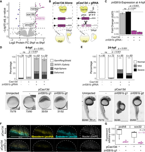
Rapid protein-level changes before genome activation elicit genome activation factors (A) Volcano plot highlighting down- (dark blue) and up-regulated (magenta) proteins between 0 and 2 h post-fertilization. Previously published genes with validated ZGA functions are labeled in black, and one uncharacterized candidate is labeled in magenta. (B) Diagram of experimental design utilizing CRISPR-Cas13d to knock down candidate genes. Two independent gRNAs targeting znf281b were used. (C) RT-qPCR targeting znf281b transcript in knocked down embryos at 4 h post-fertilization. Error bars represent SEM from at least three biological replicates per condition. Statistical significance was considered when p < 0.05 (Student’s t test). (D and E) Stacked bar plot represents proportions of developmental stages in each condition at 6 (D) and 24 (E) h post-fertilization. Representative images for each condition are below the plots, with quantification numbers under the pictures. The “deformed” category means that embryos could not be assigned to any known developmental stage when analyzed. See also Figure S7E for more examples of mild and severe phenotypes from 24 h post-fertilization embryos. Error bars represent SEM from three biological replicates, significant differences were considered when p < 0.05 (Fisher’s exact test), and n denotes the number of embryos per condition. Scale bars represent 600 μm for all images. (F) In situ hybridization chain reaction (HCR) representative pictures of one control and one of the knockdowns for znf281b g1. Dashed line denotes the embryo perimeter. (G) Fluorescent quantification of HCRs in arbitrary fluorescent units. n = 4 and n = 10 for controls and znf281b knockdown, respectively. |
|
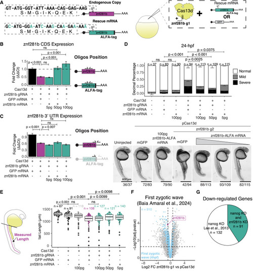
znf281b phenotype is rescued with exogenous znf281b-ALFA mRNA (A) Diagrams represent the synonymous nucleotide changes in the exogenous znf281b-ALFA mRNA and the experimental design for the rescue experiments. Exogenous znf281b-ALFA mRNA contains the 5′ and 3' untranslated region (UTR) of β-globin from Xenopus and not the endogenous UTRs. (B and C) RT-qPCR targeting znf281b CDS (B) or 3′ UTR (C) for rescued experiment. Diagram for oligo pair positions is denoted on the right of each plot. Error bars represent SEM from three biological replicates, and significant differences were considered when p < 0.05 (Student’s t test). (D) Stacked bar plot represents proportions of developmental stages in each condition at 24 h post-fertilization. Representative images for each condition are below the plots, with quantification numbers under the pictures. See also Figure S7C for more examples of mild and severe phenotypes from 24 h post-fertilization embryos. Error bars represent SEM from three biological replicates, significant differences were considered when p < 0.05 (Fisher’s exact test), and n denotes the number of embryos per condition. Scale bars represent 600 μm for all images. (E) Diagram for tail length quantification at 24 h post-fertilization and boxplot of tail lengths in μm per condition. Data represent three biological replicates, and n denotes the number of embryos measured per condition. (F) Volcano plot shows differentially expressed genes between znf281b knockdown and pCas13d controls. Magenta highlights znf281b, and light blue dots highlight the first zygotic transcription wave observed from Baia Amaral et al.21 (G) Pie chart of down-regulated genes in a nanog knockout line from Lee et al.9 and shared down-regulated genes with this study’s znf281b knockdown (teal). n is the number of down-regulated genes in each section of the chart. |

