
|
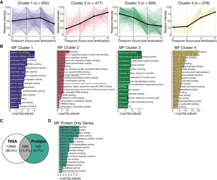
Fig. 4 Clustering protein profiles captures protein dynamics throughout the maternal-to-zygotic transition (A) Line plots represent relative protein intensity dynamics over all time points for each cluster. Colors represent different clusters, thick line denotes the median of all lines for each cluster, and n is the number of proteins in each cluster. Relative intensity values span between 0 and 100. (B) Bar plots from GO term (molecular function [MF]) enrichment analysis for each cluster. Categories were considered significant when adjusted p < 0.05 (Fisher’s exact test). (C) Venn diagram shows intersection of identified proteins with mRNA expression at the same time points. Teal colored section represents 106 proteins that are not expressed as mRNA at 0, 2, 4, or 6 h post-fertilization (see Figure S6D for individualized mRNA and protein expression). (D) Bar plots from GO term (MF) enrichment analysis for the protein only gene group. Categories were considered significant when adjusted p < 0.05 (Fisher’s exact test).