|
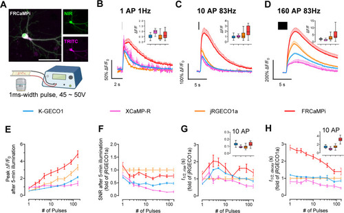
Characterization of FRCaMPi in primary mouse hippocampal neurons. (A) FRCaMPi sensor is created by topological inversion of FRCaMP. Upper panel, a diagram showing the design of FRCaMP and FRCaMPi; the lower panel predicted 3D protein structures of indicators 75 and a table of amino acid sequences of the linkers. Representative images of a neuron co-expressing FRCaMPi (TRITC) and emiRFP670 (NIR) (top) and schematics of field stimulation protocol (n = 5 neurons from two independent cultures). Scale bar, 50 µm. (B–D) Averaged fluorescence traces generated in response to (B) one pulse, (C) 10 pulses, and (D) 160 pulses for tested GECIs. Traces are shown as mean ± s.e.m, indicated by solid lines and shaded area, respectively (K-GECO1, n = 54 cells from 3 coverslips, 2 independent cultures; XCaMP-R, n = 24 cells from 2 coverslips, 2 independent cultures; jRGECO1a, n = 65 cells from 4 coverslips, 3 independent cultures; FRCaMPi, n = 56 cells from 6 coverslips, 3 independent cultures). Graph inset displays boxplot of peak ΔF/F0 of each GECI to applied action potentials. (E) Peak ΔF/F0 of FRCaMPi compared to other red GECIs as a function of pulses. Descriptive statistics here and for panels g,h,i same as in C–E. (F) Normalized SNR of FRCaMPi compared to other red GECIs as a function of pulses. Normalized to the mean value of jRGECO1a at each used pulse number. (G) The half the rise time of red GECIs as a function of pulses. (I) Half decay time of red GECIs as a function of pulses. Graph inset displays boxplot of half rise/decay time of each GECI after 10 action potentials. Box plots are used here (insets in panels C, D, E, H, I). Box indicates the median and 25–75th percentile range, and the whiskers represent 1.5 times the interquartile range. Line plots are used here (E–H) and throughout the paper (dot, mean; error bars, s.e.m.) See S4 Table for detailed statistics and exact p values. The quantitative data presented in this figure can be found in S1 Data. Created in BioRender, https://BioRender.com/e01g235.
|