FIGURE SUMMARY
Title

Differential electrographic signatures generated by mechanistically-diverse seizurogenic compounds in the larval zebrafish brain

Authors
Pinion, J., Walsh, C., Goodfellow, M., Randall, A.D., Tyler, C.R., Winter, M.J.
Source
Full text @ eNeuro

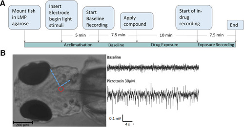
A schematic showing the experimental process and example data from in vivo electrophysiological recording in 4-d post fertilisation elavl3:GCaMP6s zebrafish larvae. A, The experimental process used. B, Left, A paralyzed, mounted zebrafish larva with glass electrode inserted into midbrain. The Red circle indicates the placement of the tip of the electrode, while the blue dashed line indicates landmarks used to consistently place the electrode. Right, local field potential recording (LFP) from midbrain of zebrafish larva at baseline and after administration of 30 μm picrotoxin.

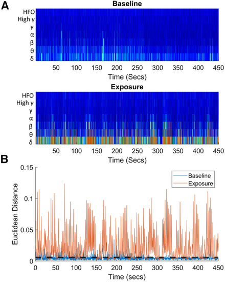
Example data obtained from in vivo electrophysiological recording in a 4-dpf elavl3:GCaMP6s zebrafish larva exposed to 62.5 μM donepezil. A, A representative frequency binned wavelet transformation from a single larva, the top graph shows the baseline and the bottom wavelet transform after drug administration. These transformations were used to identify events from the full timeseries. B, A plot of the Euclidean distance of each time point from the average of the baseline. The black dotted line represents the threshold for selecting events. All peaks above this line were selected and used to find events which were subsequently clustered.

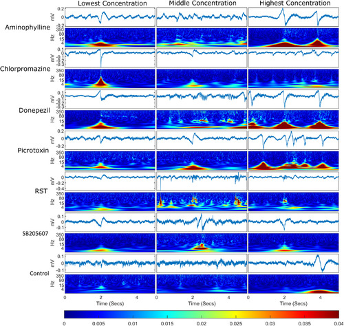
Example of an event plus 2 s either side for each treatment group. For each treatment group, the timeseries are displayed for each event with a wavelet transform below each one displaying the frequency domain over the same time period. The events selected were the events whose spectra were closest in Euclidean distance to the mean event spectra for that treatment group, meaning that these are representative of the events shown for each compound. The bottom bar shows the color scaling for the magnitude of the wavelet transformation. Each column represents a different concentration set and each row represents a different compound.

Mean number of events detected per treatment group. Bar graph showing the mean number of events per treatment group. Error bars represent the SEM (n = 7–8). Asterisks adjacent to the bars indicate a statistically significant difference from control (p < 0.05) using a Wilcoxon rank sum test corrected for multiple comparisons using the Benjamini and Hochberg method.

Analysis of the AUC of the Hilbert transform of the LFP recordings. A, Mean baseline normalized AUC of the absolute value of the Hilbert transform of the LFP averaged into 30-s time bins. The shadows represent the SEM (n = 20–24). The left-hand side of the graph represents the baseline period, while the right-hand side represents the exposure period. The gap in time from 7 to 17 min is time allotted for compounds to take effect. B, Shows the baseline normalized AUC for each of the compounds tested. The bars show the normalized AUC averaged across all treatment groups for each compound, while the normalized AUC of individual larvae are represented as transparent grey circles. Data are shown as the mean with error bars depicting the SEM (n = 20–24). An asterisk indicates a statistically significant difference between baseline and exposure periods (p < 0.05) using Wilcoxon signed-rank test and corrected for multiple comparisons using the Benjamini and Hochberg method (Benjamini and Hochberg, 1995).

Data generated for larvae exposed to each of the test compounds after spectral analysis and categorization into specific frequency bands. A, The bars show the baseline normalized mean amplitude for each of the neural frequency bands frequently used for categorizing mammalian electrophysiological data (Moffett et al., 2017; Wang et al., 2020). Data are shown as the mean with error bars showing the SEM (n = 7–20). The baseline normalized power for individual larvae are represented by the transparent grey circles. An asterisk indicates a statistically significant difference from control (p < 0.05) using Mann–Whitney U tests and corrected for multiple comparisons using the Benjamini and Hochberg method (Benjamini and Hochberg, 1995). B, Mean baseline normalized power spectra for each compound treatment group. In this case the x-axis is scaled to the common logarithm. Shading represents the SEM for each data point (n = 7–20) across the power spectra. Black lines here indicate the mean of the control animal power spectra and therefore are the same for each graph.

Multi-dimensional scaling (MDS) of the normalized power spectra. Left-hand image, A scatter graph of the first two coordinates produced after classical MDS of each individual larva. In both plots, the circles represent the lowest concentration, the triangles the middle concentration, and the diamonds the highest concentration used for each treatment group. The black square represents the control group. Right-hand image, A scatter graph of the first two coordinates produced after classical MDS of the mean normalized power spectra of each treatment group (see Fig. 6B).

Acknowledgments
This image is the copyrighted work of the attributed author or publisher, and ZFIN has permission only to display this image to its users. Additional permissions should be obtained from the applicable author or publisher of the image. Full text @ eNeuro