
Fig. 1
- ID
- ZDB-FIG-140512-37
- Publication
- Jetti et al., 2014 - Spontaneous activity governs olfactory representations in spatially organized habenular microcircuits
- Other Figures
- All Figure Page
- Back to All Figure Page
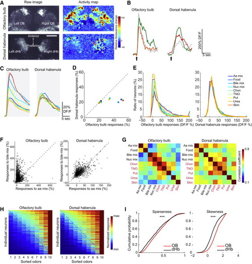
Odor Response Properties of Olfactory Bulb and Dorsal Habenula Neurons (A) Raw images and food-odor-evoked activity map in the OB and dHb of 25-day-old elavl3:GCaMP5 zebrafish. (B) Example traces for odor responses in the OB and dHb. Colors of the traces correspond to the color of the arrows in (A). Black arrows mark the delivery of food odor. (C) Average odor responses of all recorded neurons in the OB (n = 3164 neurons, n = 9 fish) and dHb (n = 917 neurons, n = 8 fish) in response to nine different odors represented by different colors. DF/F is the percent change in fluorescence. (D) Average odor responses of OB versus dHb neurons in (C) averaged during the first 5 s. Error bars represent the SEM. (E) Histograms representing the distribution of odor responses in individual OB and dHb neurons. (C–E) Colors in all panels correspond to individual odors marked in the legend of (E). Odors were as follows: skin extract (skin), urea, bileacid mixture (bile mix), nucleotide mixture (nuc mix), chondroitin-6-sulfate (chon), trimethylamine-n-oxide (TNO), putrescine (put), aminoacid mixture (aa mix), and food odor. (F) Comparison of the odor responses of all individual OB and dHb neurons in response to bile acid mixture and amino acid mixture. Every individual semitransparent point is the response of a single OB or dHb neuron. (G) Correlation matrices representing the pairwise similarity between activity patterns evoked by different odors in the OB and dHb. Odors that are reported to be aversive are in red, and those reported to be attractive are in black. (H) Normalized odor responses of all individual OB and dHb neurons. Neurons on the y axis are sorted on the basis of their response selectivity. The least-selective neurons are on the top of the graph, whereas the most-selective neurons are on the bottom of the graph. Odor responses on the x axis are sorted on the basis of the response strength after normalizing to the strongest odor response of the individual neurons (warmest color) on the right side. A black dotted line is added to help with the comparison of the OB versus dHb. (I) Cumulative distribution of sparseness and skewness for the response profiles of all individual OB (red) and dHb (black) neurons. The sparseness and skewness of OB neurons of are significantly larger than those of dHb neurons (rank-sum test, p < 0.0001). See also Figures S1–S3. |