IMAGE

Figure 1

ID
ZDB-IMAGE-210204-62
Source
Figures for Bai et al., 2021
Image
Figure Caption

Figure 1

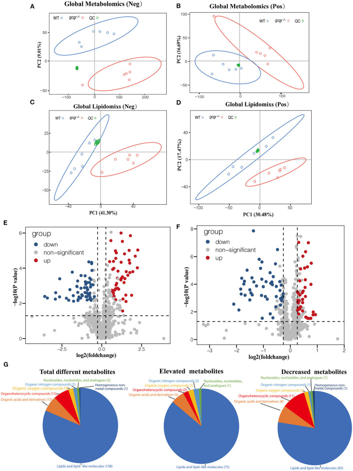
Profile of global metabolomics and lipidomics data. (A–D) Principal component analysis (PCA) of metabolomics (A,B) and lipidomics (C,D) profile of wild-type (WT) and gcgr−/− were indicated by different color circles. PCA scores were plotted in both positive mode (A,C) and negative mode (B,D). (E,F) Volcano plots of all identified metabolites from metabolomics (E) and lipidomics (F) analysis. The x-axis indicates Log2 (fold change) while the y-axis indicates -Log10 (P-value). Every single metabolite is represented as a dot. Different colors were used to represent down-regulated (blue), up-regulated (red), or non-significant (gray) metabolites. (G) Pie charts showing different classes of total different, elevated, and decreased metabolites. Different colors indicate different classes.

Acknowledgments
This image is the copyrighted work of the attributed author or publisher, and ZFIN has permission only to display this image to its users. Additional permissions should be obtained from the applicable author or publisher of the image. Full text @ Front Cell Dev Biol