
|
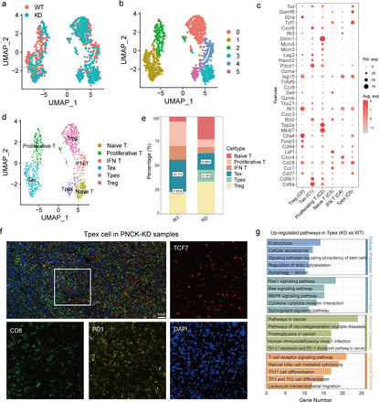
Fig. 6 Heterogeneity analysis of T cell subtypes. (a, b) UMAP analysis shows the distribution of T cell subtypes in different samples. Each point represents a single cell, colored by its subtype. (c) Bubble plots showing the expression of commonly used marker genes for each T cell subtype, used for annotating cell subtypes. The size of the bubble represents the percentage of cells expressing the marker gene, and the color intensity indicates the expression level. (d) UMAP analysis shows the distribution of different T cell subtypes. Different colors represent different T cell subtypes. (e) Proportion of each T cell subtype in the WT and knockdown groups. Bar graphs illustrate the percentage of each subtype in the two groups. (f) Multiplex immunofluorescence probed the content of Tpex cells (TCF7+ PD1+ CD8+) in PNCK-KD samples. (g) KEGG functional enrichment analysis of DEGs in the Tpex cell subtype. The bar graph shows the top enriched pathways, with the length of the bar indicating the enrichment score. DEGs, differentially expressed genes.