
- Title
-
Common and specific gene regulatory programs in zebrafish caudal fin regeneration at single-cell resolution
- Authors
- Chen, Y., Hou, Y., Zeng, Q., Wang, I., Shang, M., Shin, K., Hemauer, C., Xing, X., Kang, J., Zhao, G., Wang, T.
- Source
- Full text @ Genome Res.
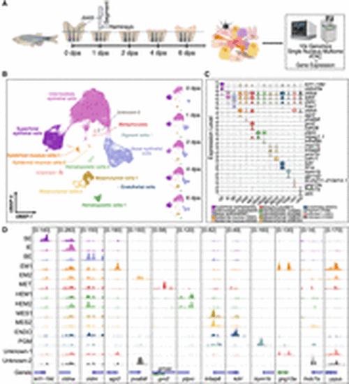
Cell-type identification in regenerating zebrafish caudal fins. (A) General experimental design. Collection of zebrafish caudal fin tissues was conducted at preinjury and 1, 2, 4, and 6 dpa for subsequent library preparation and sequencing. For all samples, we first amputated the distal half of the caudal fin. For the 0 dpa samples, we collected the first two segments of the fin rays immediately after amputation. For the 1, 2, 4, and 6 dpa samples, we collected the regenerated caudal fin tissue. This experimental workflow was partially created using bioRender (https://www.biorender.com/). (B) After quality control, cells were visualized using weighted nearest neighbor (WNN) uniform manifold approximation and projection (UMAP). (Left) Cells colored by cell types; (right) UMAPs separated by time points and colored by cell types. (C) Marker gene expression. Violin plots of log-normalized RNA expression of cell-type marker genes, with colors representing different cell types. (SE) Superficial epithelial, (IE) intermediate epithelial, (BE) basal epithelial, (EM) epidermal mucous, (MET) metaphocyte, (HEM) hematopoietic, (MES) mesenchymal, (ENDO) endothelial, (PGM) pigment, (UN1) unknown-1, (UN2) unknown-2. (D) Genome browser views showing the aggregated and normalized snATAC-seq signals at promoter regions (±1 kb from transcription start site) of selected cell-type marker genes. Tracks are colored with the same color code as in B and C. |
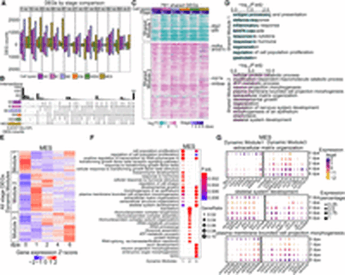
Common and cell-type-specific gene expression programs during fin regeneration. (A) Bar graphs showing the number of DEGs across stages comparisons within each cell type. Colors indicate cell types. The stage DEGs were identified between two stages. For example, “0 vs 1” means that the comparison was between 0 dpa and 1 dpa. Bars above and below the x-axis represent the number of upregulated and downregulated DEGs at 1 dpa, respectively. Similar methodology applies to other pairwise comparisons. (B) An upset plot illustrating unique and shared stage-DEGs among cell types. Stage DEGs identified within a cell type were pooled. The horizontal bar graph on the left shows the number of unique DEGs per cell type. The vertical bar graph on the top indicates the number of overlapped genes in each category. (C) A heatmap displaying log2 fold changes compared with 0 dpa of cell-type-shared DEGs, which were clustered into two modules via k-means clustering. Representative genes involved in cell proliferation and regeneration were highlighted. (D) Top GO terms enriched in each shared module in C. (E) Heatmaps showing scaled expression of all stage DEGs identified within MES, with genes clustered into three dynamic modules. Heatmaps of the other major cell types are in Supplemental Figure S2A. (F) Top 10 GO terms enriched in each dynamic modules identified in MES (E). (G) Dot plots of scaled gene expression across stages in MES showing selected genes identified from GO terms shared in MES dynamic module 1 and dynamic module 3. The GO terms are labeled on the top of each group, with dynamic module 1 genes on the left and dynamic module 3 genes on the right. Dot size indicates the percentage of cells expressing a specific gene, and dot color represents the scaled expression level. |
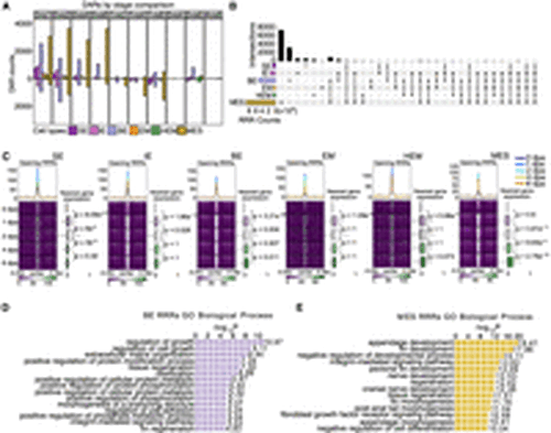
Chromatin regions linked to regenerative and developmental processes show rapid increase of accessibility at early stage of regeneration. (A) Bar graphs display the number of DARs identified between two time points within each cell type during regeneration. Each color represents a different cell type. The stage DARs were identified between any two time points. For example, “0 vs 1” means that the comparison was between 0 dpa and 1 dpa, the number of DARs more open at 1 dpa was shown in the bar graph above the x-axis, and the number of DARs more closed at 1 dpa was shown in the bar plot below the x-axis. Similar methodology applies to other pairwise comparisons. (B) An upset plot shows shared and unique stage DARs across major cell types. All stage DARs compared to 0 dpa, referred as regeneration-responsive regions (RRRs), were combined within each cell type to generate this plot. The horizontal bar graph on the left shows the number of unique stage DARs in each cell type, and the vertical bar graph represents the number of overlapped stage DARs in each category. (C) Aggregated snATAC-seq signals by time point over 5 kb flanking regions centered on opening RRRs of each cell type. Smoothed average signals for each stage are plotted at the top of each heatmap group, with the lines colored by stage. Box plots on the right of each heatmap represent the log2 fold change of expression levels of genes nearest to RRRs across time points, measured across different time points compared with 0 dpa. The P-values were calculated using a Wilcoxon rank-sum test for each two time points. (D,E) Enrichment analysis using the tool GREAT identified processes associated with RRRs in BE cells and MES cells, respectively. |
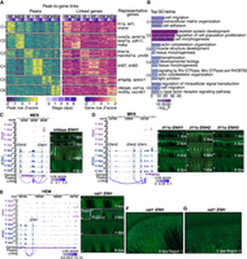
Characterization of common and cell-type-specific cis-regulatory elements in regeneration. (A) Heatmaps display chromatin accessibility (left) and gene expression (right) for peak-to-gene links, with peaks clustered using k-means clustering (k = 6, C1 through C6 represent the six clusters) across cell types and stages. For each cluster, selected highly regulated genes (with more than five linked peaks) relevant to the GO terms in B are displayed next to the gene expression heatmap. (B) Representation of enriched top GO terms associated with the highly regulated genes linked to each peak cluster in A. (C,D) On the left, WashU Epigenome Browser views show aggregated and normalized snRNA-seq signals (pink tracks) and snATAC-seq signals (blue tracks) across time points surrounding genes inhbaa and il11a in MES cells, respectively. Regions of candidate RREs are shaded in gray. Below these signal tracks, the loops illustrate peak-to-gene linkages identified in MES cells. On the right, in vivo enhancer reporter assay results for these enhancer regions are shown across various regenerating stages from F0 zebrafish. The white arrows indicate amputation site. (E) Similar to C and D but presenting a WashU Epigenome Browser view around the gene vat1 in the HEM cells. Candidate RRE is highlighted in gray shades. On the right, in vivo enhancer reporter assay results for this enhancer region are shown across various regenerating stages from F0 zebrafish. The white arrows indicate amputation site. (F,G) Two zoomed-in views from the 2 dpa regenerating fin shown in E. |
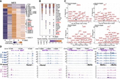
Gene regulatory network construction in the MES cells. (A) A heatmap displays differential activity of motifs over time in pseudobulk MES cells, with particular motifs of interest marked on the side. Motifs critical for bone development are indicated in red. (B) A dot plot illustrates the expression of TF genes and their degree centrality over time, corresponding to the motifs presented in A. TF genes critical for bone development are indicated in red. (C) A scatter plot shows the top targets of Runx2a at the regenerating stages. Targets were ranked by grnboost2 TF–target importance scores. The y-axis represents grnboost2 score; the x-axis shows log2 fold change of target gene expression compared with 0 dpa. (D) Example views from the WashU Epigenome Browser of Runx2 and Mef2c footprints located in regions that become more accessible during regeneration, along with their nearby targeted genes. Blue tracks are aggregated and normalized snATAC-seq signals across time points; pink tracks are aggregated and normalized snRNA-seq signals across time points. The TF bound track shows predicted TF binding footprints. Shaded areas highlight DARs that gained accessibility during regeneration. |
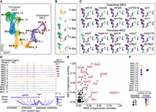
MES sublineages and lineage-specific regulatory networks. (A) A UMAP plot shows MES subclusters. Cells are colored by subclusters. (B) A set of UMAP plots divided from A by time points. (C) A set of UMAP plots with embedded RNA expression of marker genes. (D) A genome browser view generated with Signac CoveragePlot displays pseudobulk snATAC-seq signals for each subcluster around the cdh11 gene. Annotations at the bottom indicate the transcript region, ATAC-seq peaks, and peak-to-gene links. Violin plot on the right side shows the normalized RNA expression levels of cdh11 across each cluster. Tracks and violin plots are colored by subclusters. (E) A scatter plot shows the top TFs in the MES_3 and MES_5 subclusters, ranked by their eigenvector centrality scores. (F) A dot plot showing RNA expression of mef2cb and lmx1ba across subclusters. |