
Fig. 7
- ID
- ZDB-IMAGE-250425-17
- Publication
- Huang et al., 2025 - Identification and functional validation of a novel FBN1 variant in a Marfan syndrome family using a zebrafish model
- All Figures
- Figures for Huang et al., 2025
|
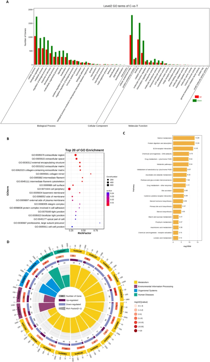
Fig. 7 Differential gene expression analysis. (A) The bar chart of GO enrichment analysis. The x-axis represents the second-level GO terms, the y-axis represents the number of differentially expressed genes in that term, with red indicating upregulation and green indicating downregulation. (B) bubble diagram of the top 15 noticeably enriched pathways. The graph is plotted with p-values of significance for various pathways. The abscissa denotes the gene-rich factor (i.e., the number of differential genes enriched to the current pathway/the number of that species enriched to the current pathway), and the ordinate represents the pathway. Bubble size represents the number of genes enriched in different pathways, and bubble color represents the degree of enrichment in different pathways. (C) statistical plot of the grade B classification of each pathway of the differentially enriched genes. (D) circle-marker plots of the top 15 significantly enriched differential pathways. Outside the circle is a sitting ruler of the gene number. Different colors represent different KEGG A Class