
Fig. 2
- ID
- ZDB-IMAGE-220823-2
- Publication
- Song et al., 2022 - GATA4/5/6 family transcription factors are conserved determinants of cardiac versus pharyngeal mesoderm fate
- All Figures
- Figures for Song et al., 2022
|
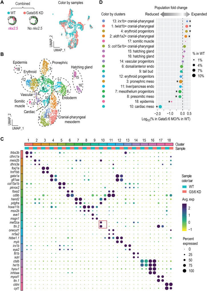
Fig. 2
(A and B) UMAP visualization of merged single-cell datasets from 13 hpf WT and Gata5/6 KD samples, colored by sample (A) or cluster IDs (B). (C) Dot plot showing the mean expression levels (color) of marker genes and the percentages of cells in which marker genes are expressed (size) in each cluster, with WT and Gata5/6 KD cells plotted separately. Red square indicates the marker gene expression in the cardiac lineage. (D) Cell composition changes of each cluster between Gata5/6 KD and WT samples. Asterisks indicate significant differences (Fisher’s exact test, Bonferroni correction, adjusted P < 0.05). Dot sizes show the percentage of each cluster within the whole WT population.