
Image
|
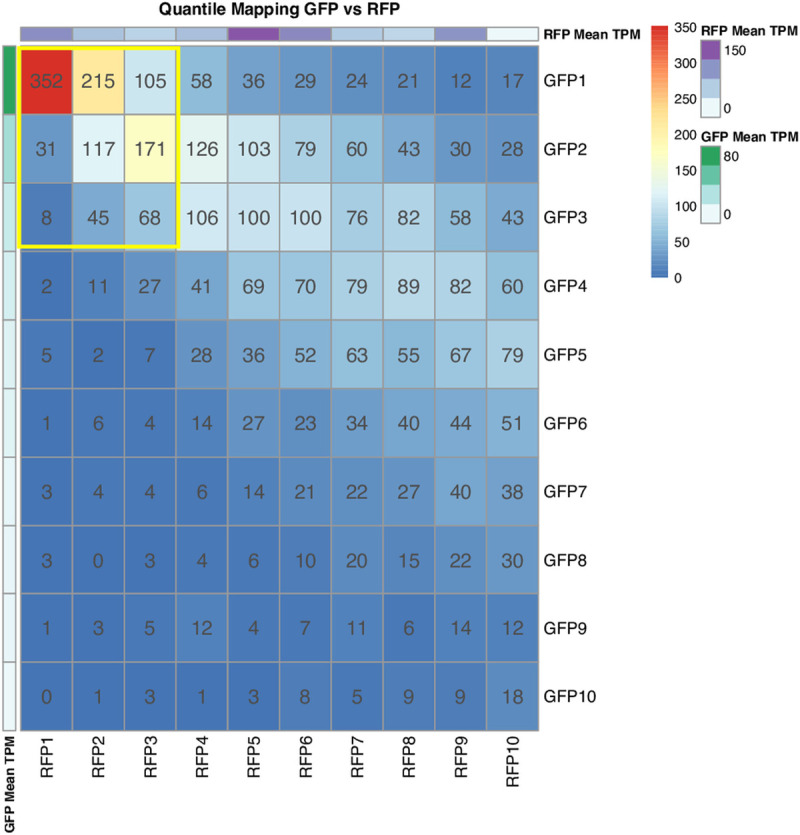
Figure Caption
Fig 4
We have divided the expressed genes in each dataset into 10 quantiles. We have compared the genes in each quantile across the pair of datasets. In each quantile, the quantile map shows the number of common genes between the two datasets. The bars on the right of the quantile map indicate the color codes and the number of genes. The data value bars on the rightmost indicate mean TPM values; green color, the highest TPM values for GFP+ thrombocytes, and purple color, the highest TPM values for RFP+ thrombocytes.
Acknowledgments
This image is the copyrighted work of the attributed author or publisher, and
ZFIN has permission only to display this image to its users.
Additional permissions should be obtained from the applicable author or publisher of the image.
Full text @ PLoS One