
|
FIGURE 2
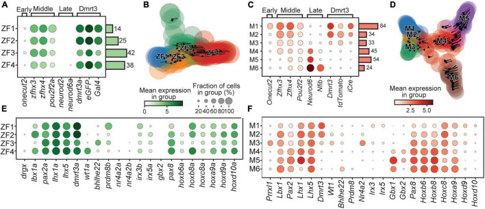
Birth order and rostro-caudal origin of the clusters. Dotplot of genes associated with the time of birth for zebrafish (A) and mouse (C). Stream plots of all cells in the zebrafish (B) and the mouse (D) datasets plotted using diffusion map embedding. Arrows in the plot represents the average velocity of cells in that region. Given time, cells would follow the arrows. (E) Dotplot of transcription factors and lineage associated genes in zebrafish. (F) Same as (E) but for mouse. In dotplots, size of dots represents the proportion of cells in a group that has transcripts for a given gene and the color intensity represents the mean expression level in a group for a given gene.