
|
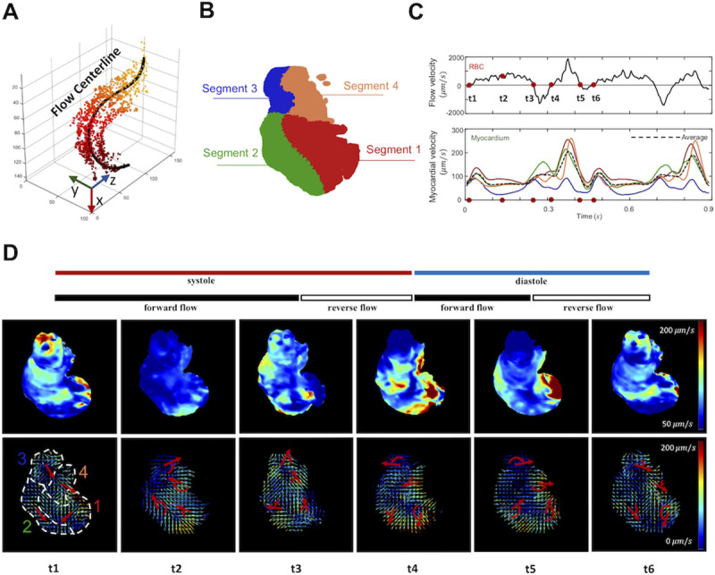
Fig 3
(A) The trajectory of the blood cells is depicted as the flow centerline, starting from the AV canal (dark colors) to the outflow tract (light colors). (B) The myocardium is divided into 4 segments to assess regional variations in the vector field. (C) The velocity of individual blood cells is projected onto the flow centerline, and the mean flow velocity is plotted as a function of time. Myocardial velocity in each segment is quantified as the magnitude-weighted mean vector for each segment, as plotted in the color line. The black dotted line demonstrates the average velocity magnitude of the entire ventricle. (D) Six representative time points (from t1 to t6) of the heatmaps are presented for the myocardium (upper panels, color-coded in vector magnitude) and vector maps (lower panels). Red arrows indicate the rotational direction of the mean vector for each segment.