
Image
|
Figure Caption
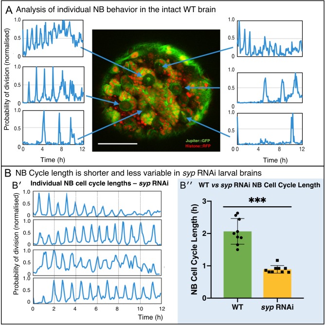
Figure 5 (A) Using the proximity map output of CytoCensus, individual NBs can be followed through their cell cycle. Arrows: Individual NB locations, and the corresponding proximity map output plotted over time for that NB. (B) Comparison of WT and syp RNAi NB: (B′) analysis of cell cycle over time for individual NBs from a syp RNAi brain; (B′′) comparison of cell cycle lengths for individual NB in a single WT vs syp RNAi brain (p=0.002, F-test, n = 9 NB). Scale bar 40 µm
Acknowledgments
This image is the copyrighted work of the attributed author or publisher, and
ZFIN has permission only to display this image to its users.
Additional permissions should be obtained from the applicable author or publisher of the image.
Full text @ Elife