|
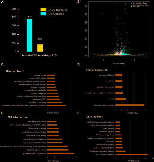
(A) Statistical chart of the number of DEGs. The horizontal axis represents comparison of different samples, the vertical axis represents the number of DEGs, red represents up-regulation, blue represents down-regulation. (B) Volcano Plot of DEGs. Each dot in the volcano plot of DEGs represents a gene. The red dots in the plot represent up-regulated DEGs, the blue dots represent down-regulated DEGs, and the black dots represent non-differentially expressed genes. The dotted line means the threshold lines of FDR and fold change (C) Biological Process diagram of DEGs. X axis represents -log10 (p-value). Y axis represents enrichment names. (D) Cellular component diagram of DEGs. (E) Molecular function diagram of DEGs. (F) Diagram of KEGG pathway.
|