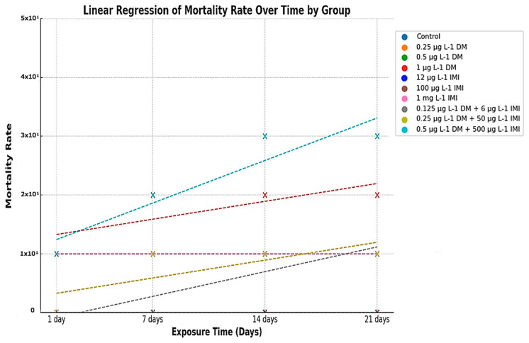
IMAGE

Figure 3

ID
ZDB-IMAGE-250428-33
Source
Figures for Petrovici et al., 2025
Image
Figure Caption

Figure 3

Linear regression of mortality rate over time across experimental groups. The y-axis represents the mortality rate (%) recorded at four-time points (1, 7, 14, and 21 days), while the x-axis denotes the exposure duration. Colored markers (X) indicate observed mortality data for each experimental group while corresponding dashed lines represent the linear regression fit for each condition. Statistical significance was assessed using ANOVA and post hoc comparisons to evaluate differences in mortality trends between exposure groups.

Acknowledgments
This image is the copyrighted work of the attributed author or publisher, and ZFIN has permission only to display this image to its users. Additional permissions should be obtained from the applicable author or publisher of the image. Full text @ Life (Basel)