
|
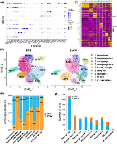
Fig. 5 Identification of macrophage/myeloid cell subtypes. (A) Dot plot showing the expression levels of marker genes and the percentages of macrophages/myeloid cell per cluster that express the gene of a specific cell population subtype. (B) Heatmap of marker genes from each cluster. Each column in the figure represents a cell subpopulation, and each row represents a gene. The expression levels of genes in different cells are indicated by different colors. (C) tSNE nonlinear clustering was used to visualize the differences in the classification results of macrophage/myeloid cell populations between the control group (PBS) and the SVCV-infected group. Numbers represent the percentages of cells in each cluster. (D) Histogram presenting the different macrophages/myeloid cell ratios between the control group and the SVCV-infected group. (E) Histogram illustrating the difference in macrophage/myeloid cell number in each cluster between the control group and the SVCV-infected group.