
Figure 4
- ID
- ZDB-IMAGE-230217-2
- Publication
- McGarvey et al., 2022 - Single-cell-resolved dynamics of chromatin architecture delineate cell and regulatory states in zebrafish embryos
- All Figures
- Figures for McGarvey et al., 2022
|
Figure 4
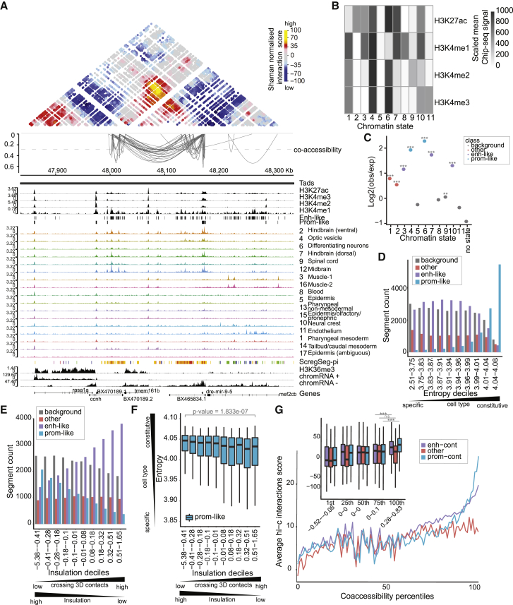
Accessibility dynamics are reflected in histone PTM states and 3D genome organization
(A) Browser shot around the dre-mir-9-5 locus showing strong concordance between (from top to bottom) SHAMAN 3D interaction score heatmap, Cicero co-accessibility arcs for scores >0.28 (top 1% score cutoff; dashed line), histone PTM signals and promoter-like/enhancer-like HMM state calls, cluster-collapsed sci-ATAC-seq signals, sci-ATAC-seq segmentation calls, H3K36me3 signal, and nascent chromatin-associated RNA signal. Co-accessibility arcs are clearly enriched between strong interaction regions (orange/yellow in Hi-C heatmap), and these anchor points are clearly marked with enhancer-like and promoter-like PTMs, as captured by the histone PTM states. Co-accessibility is also observed in the sci-ATAC-seq signal tracks and reflected in the similar coloring of the sci-ATAC-seq segmentation calls.
(B) A heatmap representing histone PTM chromatin states learned. Each state is a multivariate Gaussian distribution and is plotted as the mean scaled ChIP-seq signal for each PTM.
(C) 1-kb segments from the sci-ATAC-seq foreground are classified for their most representative histone PTM state (see
(D) Entropy scores (low = cell specific, high = constitutive) for foreground sci-ATAC-seq regions were split into deciles, and within each decile the number of regions for each type of histone PTM state was counted and plotted.
(E)
(F)
(G) SHAMAN Hi-C interaction score means (full plot lines) or distributions (inset boxplots) are plotted for pairs of sci-ATAC-seq foreground regions that are >25-kb apart and within the same TAD. Region pairs are split first by Cicero co-accessibility score percentiles and then by having a promoter-like histone PTM state in one or both of the 2 regions (prom-cont), having no promoter-like histone PTM regions but having 1 or 2 enhancer-like PTM regions (enh-cont), or where neither region is promoter-like or enhancer-like (other). Mean lines for all 100 percentiles are plotted for ease of visualization, and boxplot insets for the 1st, 25th, 50th, 75th, or 100th percentiles are shown to give a better sense of the distributions. Counts for each group can be seen in