
|
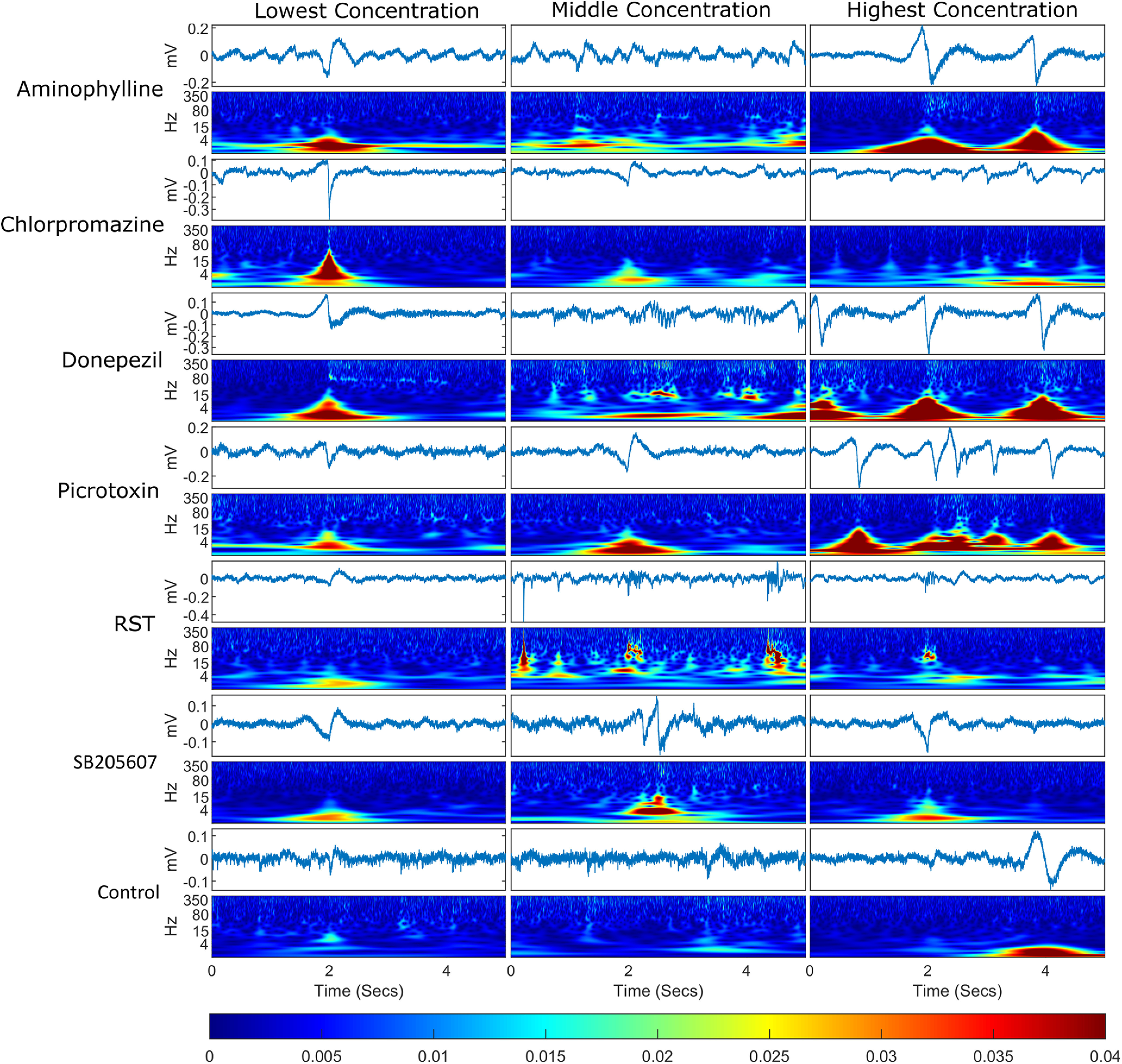
Figure 3.
Example of an event plus 2 s either side for each treatment group. For each treatment group, the timeseries are displayed for each event with a wavelet transform below each one displaying the frequency domain over the same time period. The events selected were the events whose spectra were closest in Euclidean distance to the mean event spectra for that treatment group, meaning that these are representative of the events shown for each compound. The bottom bar shows the color scaling for the magnitude of the wavelet transformation. Each column represents a different concentration set and each row represents a different compound.