
Image
|
Figure Caption
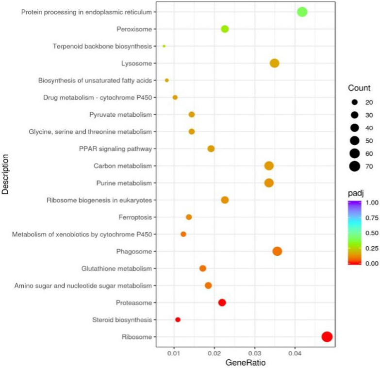
FIGURE 5
Differentially expressed genes analysis between the HCD and OGAG groups based on KEGG pathway data. Bubble chart shows enrichment of differentially expressed genes in signaling pathways. Y‐axis label represents pathway, and X‐axis label represents Gene Ratio (the number of genes in this entry is a percentage of all genes). Size and color of the bubble represent the amount of differentially expressed enriched in pathway, and the enrichment significance as the rich factor padj, respectively
Acknowledgments
This image is the copyrighted work of the attributed author or publisher, and
ZFIN has permission only to display this image to its users.
Additional permissions should be obtained from the applicable author or publisher of the image.
Full text @ Food Sci Nutr