
|
Figure 2
Spatially Distinct Clusters Represent Low- and High-Frequency Information
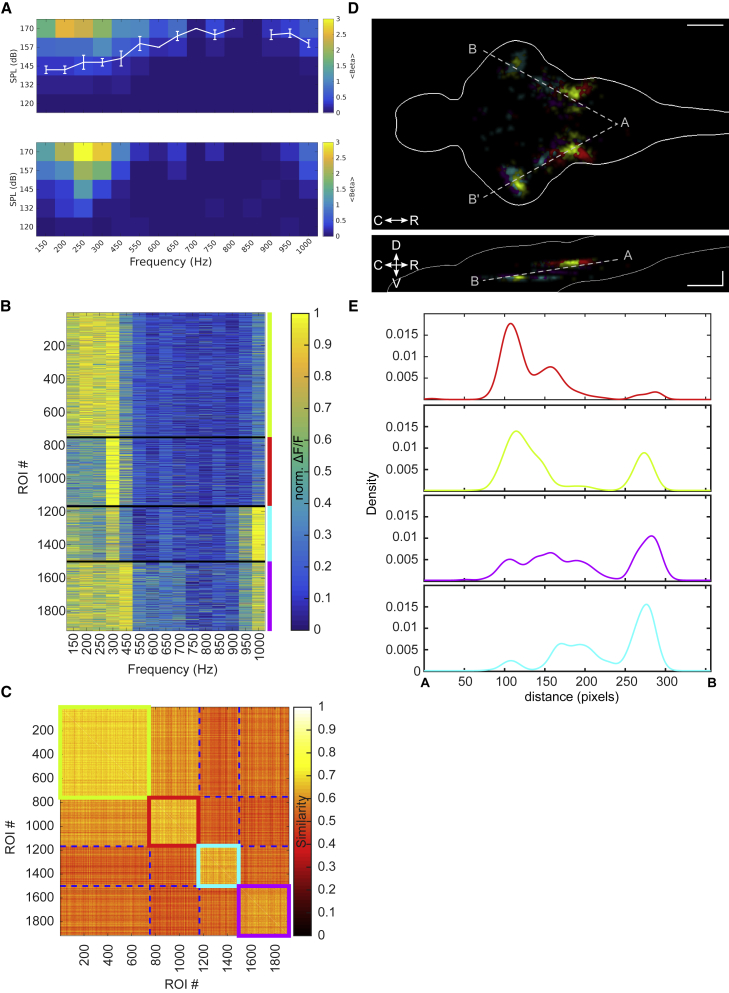
(A) Top: average audiogram (5 larvae at 8 dpf), measured as the amplitude of the neuronal response fit by a linear regression model, averaged over all ROIs in the brain. White curve: average threshold and SEM are shown. Bottom: single larva example is shown.
(B) Frequency tuning curves for 13 larvae at 8 dpf, grouped in 4 clusters using k-means clustering algorithm with Euclidean distance on normalized ΔF/F values. Different larvae were imaged at different optical sections. Clusters 1–4 are represented in red, green, cyan, and magenta.
(C) Similarity matrix based on the Euclidean distance for the clusters in (B).
(D) Spatial distribution of the 4 clusters presented in (B). All 13 larvae were aligned on a reference stack using affine transformation. Top: maximum density projection across the Z axis is shown. Bottom: maximum density projection across the y axis is shown. Scale bar, 100 μm.
(E) Spatial density of ROIs for each cluster along the gray dashed AB axis in (D), averaged across both hemispheres. See also