
Fig. S3
- ID
- ZDB-IMAGE-161018-18
- Publication
- D'Orazi et al., 2016 - Mismatch of Synaptic Patterns between Neurons Produced in Regeneration and during Development of the Vertebrate Retina
- All Figures
- Figures for D'Orazi et al., 2016
|
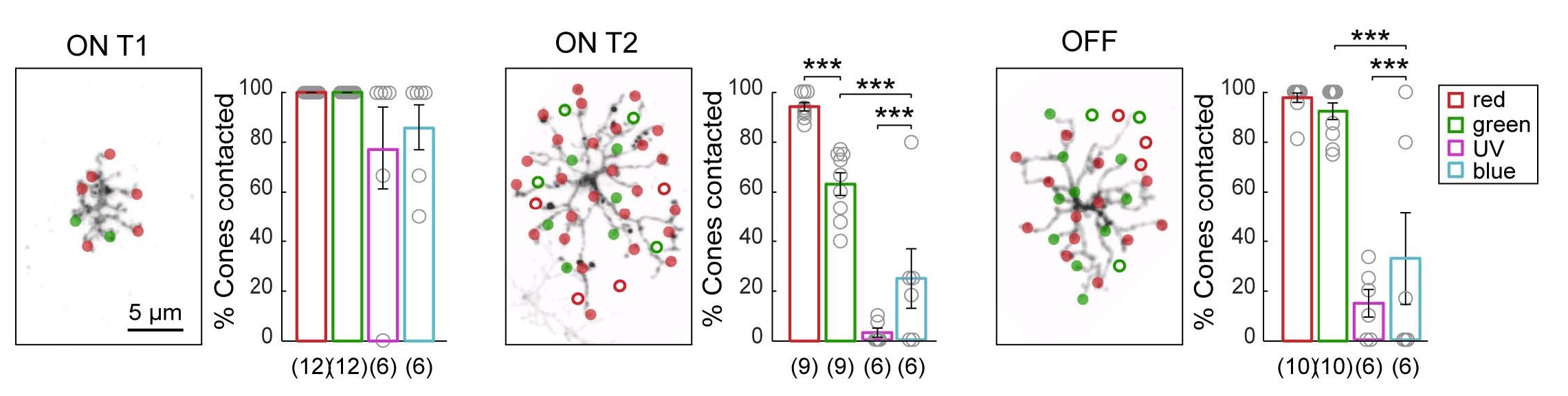
Fig. S3
Related to Figure 3. Differences in BC Wiring with Preferred Partners to Generate Biased Connectivity. Plots show the percentage of cones contacted relative to the number of available cones of each type (% cones contacted). Open circles represent individual cells, with the number of cells analyzed shown in parentheses. Error bars are ± SEM. *** P < 0.0001, Chi-square test. Connectivity maps demonstrate the method used for quantifying the number of "available" cones of each cone type, with only red and green cones shown. In the maps, filled circles mark the locations of cone contacts, open circles denote the center of mass of cone terminals within the BC dendritic territory that were not contacted.